前言
上一章已经讲了 vuepress 主题如何实现继承,这样我们可以任意修改默认主题的任何组件及样式了。我们知道 vuepress 是无法自动根据我们 markdown 文件中的
---
tags:
- js
- vue
---
2
3
4
5
生成标签云的页面的,而一个博客,标签在其中有知识分类及导航功能,是必不可少的一环,下面带领大家来改造一下默认主题让它能支持自动生成标签云页面
第一步配置的修改
既然是主题,就要提供可定制化,如果有人不需要 tag 功能,那也需要满足需求,打开 config.js 文件,修改其中的配置
themeConfig: {
    ...
    tags:"/tags",
    ...
    nav: [
    ...
        {
            text:"标签云",
            link:'/tags/',
            tags:true
        },
    ...
    ]
    ...
}
2
3
4
5
6
7
8
9
10
11
12
13
14
15
我这样配置的原因是 nav 是给头部目录添加菜单,tags:"/tags"是定义标签路由路径,这样不管我的标签页定义成什么名字,都能导航到正确的位置。
第二步文件夹建立
由于 vuepress 是根据 markdown 文件生成的路由,所以想要生成一个标签的页面也必须建立一个 markdown 文件。
在.vuepress 文件夹下建立 tags 文件夹,其中新建 README.md 文件。
重启项目
可看到
第三步新建 Tags 组件
在 docs/.vuepress/theme/components 下新建 Tags.vue 文件。 为了使页面自动集成 tag 组件,需要修改 Layout.vue 组件,上一节我们讲过要修改默认主题可以用组件的继承,现在把默认主题的 Layout 组件复制到 docs/.vuepress/theme/layouts 目录下(如果不知道如何复制默认主题的 Layout 请看上一节),修改其中的
...
    </Sidebar>
    <!-- 侧边栏 -->
    <Home v-if="$page.frontmatter.home"/>
    <!-- 如果md文件中有 home:true 就使用该组件 -->
    <Tags v-else-if="tags"/>
    <Page
        v-else
        :sidebar-items="sidebarItems"
        >
            <slot
            name="page-top"
            slot="top"
            />
            <slot
            name="page-bottom"
            slot="bottom"
            />
    </Page>
...
2
3
4
5
6
7
8
9
10
11
12
13
14
15
16
17
18
19
20
在script中对tags变量的判断
export default {
  ...
  data() {
    return{
      ...
      tags:false
    }
  },
  ...
  created(){
    this.checkTags()
  }
  ...
  checkTags() {
      path=this.$route.path
      let tags = this.$site.themeConfig.nav.filter(v => v.tags); //判断tags
      if (tags[0].link === path) {
        this.tags = true;
        this.$page.frontmatter.sidebar = false; //tags不需要侧标栏
      } else {
        this.tags = false;
      }
      //判断是否是分类页面
      let type = this.$page.frontmatter.type;

      if (type === "classify") {
        this.type = "classify";
        this.$page.frontmatter.sidebar = false; //tags不需要侧标栏
      } else {
        this.type = "";
      }
      if (this.$page.frontmatter.defaultHome) {
        this.$page.frontmatter.sidebar = false; //主页不需要侧标栏
      }
    }
  }
2
3
4
5
6
7
8
9
10
11
12
13
14
15
16
17
18
19
20
21
22
23
24
25
26
27
28
29
30
31
32
33
34
35
36
引入 Tags 组件,其中的 tags 是判断当前页面路由 tags 是否为 true,这是 config.js 中配置的选项。 再新建的 Tags.vue 文件中加入以下内容,这是我定义的tag组件,你们可以根据我的组件自行修改
<template>
  <div>
    <div class="content default"></div>
    <div class="tag">
      <div class="items">
        <span
          v-for="taginfo in tags"
          :style="{backgroundColor:color()}"
          @click="change(taginfo.tag)"
          :class="taginfo.tag===tg?'active':''"
        >{{taginfo.tag}}({{taginfo.number}})</span>
      </div>
      <div class="article-list">
        <Article v-for="tag in info" :tag="tag" :tg="tg" @turnTo="change"/>
      </div>
    </div>
  </div>
</template>

<script>
import Article from "@theme/components/Article.vue";
export default {
  components: {
    Article
  },
  data() {
    return {
      info: [],
      tg: ""
    };
  },
  computed: {
    tags() {
      //核心代码,整合markdown中tags的数目
      let allTags = [];
      this.$site.pages.forEach(v => {
        if (v.frontmatter.tags) {
          allTags.push(v.frontmatter.tags);
        } else if (v.frontmatter.tag) {
          allTags.push(v.frontmatter.tag);
        }
      });
      allTags = allTags.join(",").split(",");
      let flatTags = Array.from(new Set(allTags));
      return flatTags.reduce((res, v) => {
        let o = {};
        o.tag = v;
        o.number = allTags.filter(value => value === v).length;
        res.push(o);
        return res;
      }, []);
    }
  },
  methods: {
    change(tag) {
      //点击标签下面文章显示对应的内容
      this.tg = tag;
      this.info = this.$site.pages.filter(v => {
        let tags = v.frontmatter.tags;
        if (tags) {
          return tags.some(v => v === tag);
        }
      });
    },
    color() {
      // 标签button颜色
      let colors = [
        "#3498DB",
        "#3EAF7C",
        "#5CBBF6",
        "#f5A28E",
        "#f2AC3B",
        "#FA6551",
        "#C68CE0"
      ];
      return colors[parseInt(Math.random() * colors.length)];
    }
  },
  mounted() {
    //当路由?tag='xxx'时能自动跳转到对应内容
    let tag = this.$route.query.tag;
    if (tag) {
      this.change(tag);
    }
  }
};
</script>

<style lang='stylus' scoped>
.tag {
  max-width: 46.5rem;
  margin: 0 auto;
  padding: 0 2.5rem;

  .items {
    margin-bottom: 2rem;

    span {
      vertical-align: middle;
      cursor: pointer;
      margin: 0.5rem 0.5rem 0.2rem;
      padding: 0.4rem 0.7rem;
      display: -webkit-inline-box;
      display: -ms-inline-flexbox;
      display: inline-flex;
      border-radius: 0.2rem;
      background: #fff;
      color: #fff;
      font-size: 1rem;
      box-shadow: 0 1px 0.25rem 0 hsla(0, 0%, 57%, 0.21);
      transition: all 0.3s;
      background-color: red;

      &.active {
        transform: scale(1.2);
      }

      &:hover {
        transform: scale(1.2);
      }
    }
  }
}
</style>
2
3
4
5
6
7
8
9
10
11
12
13
14
15
16
17
18
19
20
21
22
23
24
25
26
27
28
29
30
31
32
33
34
35
36
37
38
39
40
41
42
43
44
45
46
47
48
49
50
51
52
53
54
55
56
57
58
59
60
61
62
63
64
65
66
67
68
69
70
71
72
73
74
75
76
77
78
79
80
81
82
83
84
85
86
87
88
89
90
91
92
93
94
95
96
97
98
99
100
101
102
103
104
105
106
107
108
109
110
111
112
113
114
115
116
117
118
119
120
121
122
123
124
125
其中 Article 组件是标签中显示文章内容的部分的组件,大家可自行定义组件及样式,我贴上自己的 Article 组件
<template>
  <div class="abstract">
    <div class="abstract-item">
      <div class="text-hover">
        <router-link :to="tag.path">{{tag.title}}</router-link>
      </div>
      <!---->
      <div class="abstract">
        <div class="tip custom-block" v-if="tag.excerpt">
          <!-- <p class="custom-block-title">{{tag.title}}</p>
            <p>个人一些自动的 vs code 配置(Settings.json)</p>
            <ul>
            <li>VsCode 常用插件配置</li>
          </ul>-->
          <div v-html="tag.excerpt"></div>
        </div>
      </div>
      <div class="details-btn">
        <router-link :to="tag.path">
          <div data-v-e422eb16 class="v-btn">
            <i data-v-e422eb16 class="what"></i>
            阅读全文
          </div>
        </router-link>
      </div>
      <div class="v-divider"></div>
      <div class="article-info article-info-item">
        <i class="what">
          <em v-if="tag.lastUpdated">{{tag.lastUpdated}}</em>
        </i>
        <i class="what" v-for="t in tag.frontmatter.tags">
          <em class="text-item active" v-if="t==tg">{{t}}</em>
          <em class="text-item" v-else @click="$emit('turnTo',t)">{{t}}</em>
        </i>
        <!-- <i
            class="iconfont h-classify article-info-item"
            class="what"
            >
            <em class="text-item">IDE</em>
        </i>-->
      </div>
    </div>
  </div>
</template>

<script>
export default {
  props: {
    tag: {}, //索引到的数据
    tg: ""
  }
};
</script>

<style lang="stylus" scoped>
$color = #3eaf7c;

.abstract {
  margin-top: 1rem;
  width: 100%;

  .abstract-item {
    margin: 0 auto 1.2rem;
    padding: 1rem 1.2rem;
    width: 100%;
    overflow: hidden;
    border-radius: 0.3rem;
    -webkit-box-sizing: border-box;
    box-sizing: border-box;
    -webkit-transition: all 0.3s;
    transition: all 0.3s;
    -webkit-box-shadow: 0 0.25rem 1.2rem 0 hsla(0, 0%, 57%, 0.21);
    box-shadow: 0 0.25rem 1.2rem 0 hsla(0, 0%, 57%, 0.21);
    background-color: #fff;
    position: relative;

    .abstract {
    }

    .text-hover {
      position: relative;
      font-size: 1.2rem;
      line-height: 2rem;
      display: inline-block;

      a {
        &:after {
          content: '';
          position: absolute;
          width: 101%;
          height: 2px;
          bottom: 0;
          left: 0;
          background-color: $color;
          visibility: hidden;
          -webkit-transform: scaleX(0);
          transform: scaleX(0);
          -webkit-transition: 0.3s ease-in-out;
          transition: 0.3s ease-in-out;
        }

        &:hover:after {
          visibility: visible;
          -webkit-transform: scaleX(1);
          transform: scaleX(1);
        }
      }
    }

    .details-btn {
      text-align: right;
      margin: 0.6rem 0;

      .v-btn {
        display: inline-block;
        font-size: 0.8rem;
        padding: 0.4rem 0.7rem;
        cursor: pointer;
        letter-spacing: 0.1em;
        -webkit-transition: all 0.3s;
        transition: all 0.3s;
        background-color: #efefef;
        color: #2c3e50;
        border-radius: 0.1rem;
        line-height: 1.2;

        &:hover {
          background-color: $color;
          color: #fff;
        }
      }
    }

    .article-info {
      margin-right: 1rem;
      line-height: 1.6rem;
      margin-right: 1rem;
      line-height: 1.6rem;
      font-style: normal;

      .text-item {
        font-weight: 700;
        border: 1px $color;
        font-style: normal;
        margin-left: 0.4rem;
        cursor: pointer;
        background-color: #f6f6f6;
        padding: 0.2rem 0.4rem;

        &.active {
          color: $color;
        }

        &:hover {
          color: $color;
        }
      }
    }

    .v-divider {
      display: block;
      -webkit-box-flex: 1;
      -ms-flex: 1 1 0px;
      flex: 1 1 0px;
      max-width: 100%;
      height: 0;
      max-height: 0;
      border: solid;
      border-width: thin 0 0 0;
      -webkit-transition: inherit;
      transition: inherit;
      border-color: rgb(234, 236, 239);
      margin-top: 0.7rem;
      margin-bottom: 0.7rem;
    }
  }
}

.what {
  font-size: 0.8rem;
  color: rgb(153, 153, 153);
}
</style>
2
3
4
5
6
7
8
9
10
11
12
13
14
15
16
17
18
19
20
21
22
23
24
25
26
27
28
29
30
31
32
33
34
35
36
37
38
39
40
41
42
43
44
45
46
47
48
49
50
51
52
53
54
55
56
57
58
59
60
61
62
63
64
65
66
67
68
69
70
71
72
73
74
75
76
77
78
79
80
81
82
83
84
85
86
87
88
89
90
91
92
93
94
95
96
97
98
99
100
101
102
103
104
105
106
107
108
109
110
111
112
113
114
115
116
117
118
119
120
121
122
123
124
125
126
127
128
129
130
131
132
133
134
135
136
137
138
139
140
141
142
143
144
145
146
147
148
149
150
151
152
153
154
155
156
157
158
159
160
161
162
163
164
165
166
167
168
169
170
171
172
173
174
175
176
177
178
179
180
181
182
183
184
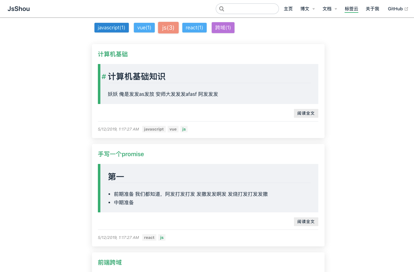
至此,标签云页面已经完成,效果如下
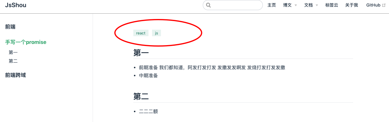
第四步 页面显示标签页及标签页跳转
Page组件是文章显示的内容组件,如果需要在文章显示的时候把标签显示到文章头部,就需要改造Page组件。
把默认主题中 components 下的 Page.vue 文件复制到 docs/.vuepress/theme/components 中, 修改其中内容
<slot name="top"/>
<!-- 以下是添加的内容 -->
<section class="tags" v-if="this.$site.themeConfig.tags&&tags&&tags.length>0">
    <!-- tags是this.$page.frontmatter.tags,这是通过vuepress编译markdown文件中的tags生成的标签数组。 -->
    <span class="tagPopup" v-for="tag in tags">
        <!-- $site.themeConfig.tags是config.js中配置的tags目录 -->
        <router-link :to="'/'+$site.themeConfig.tags+'/?tag='+tag" class="tag">{{tag}}</router-link>
    </span>
</section>
<!-- 以上是添加的内容 -->
<Content/>
2
3
4
5
6
7
8
9
10
11
12
修改后效果如下
至此,标签云的改造大致完成,这里贴上我改造好的源码地址:vuepress-theme-reform
查看效果可来到我的博客